What's New in Incorta Cloud 2022.8.0
Release Highlights
In the 2022.8.0 Cloud release, Incorta introduces more flexibility to rearrange and resize insights on a dashboard. In addition, Incorta now enables you to add more information to the insights using the new Tooltip tray in the Analyzer.
There are also more enhancements and improvements in other modules, such as the Schema Diagram Viewer and the selector components, giving you more interactivity with the information displayed in those dashboards.
New Features
Here are the main new features introduced in this release:
- Flexibility arranging and resizing insights in dashboards
- New Tooltip tray
- Dashboard runtime filters enhancements
- Schema Diagram Viewer improvements
- Numeric Range Slicer
Flexibility arranging and resizing insights in dashboards
Now you have more flexibility in arranging and resizing insights within a dashboard.
- You can stack charts on each other in the same row and make insights that span multiple rows.
- You can also freely resize the insights in the following ways:
- For multiple insights within the same row, drag and drop the horizontal border line to resize all insights in that row
- For a single insight, drag and drop the vertical border line to resize that particular insight
- Drag and drop an insight below another one to coincide with a third within the same row
For more information, refer to Guide → Analyze.
New Tooltip tray
Incorta added a new tray, Tooltip, in the Analyzer for several visualizations. You can add different types of pills to this tray; such as number, string and date; and eventually, it will appear as a tooltip when you hover over a certain point at the insight. Adding pills to this tray is optional.
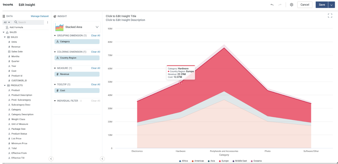
Currently, this tray is only available in the following visualizations:
- Line
- Percent Line
- Stacked Line
- Bar
- Percent Bar
- Stacked Bar
- Column
- Percent Column
- Stacked Column
- Area
- Percent Area
- Stacked Area
For more information, refer to the documentation for each visualization.
Dashboard runtime filters enhancements
This release enhances the user experience and usability of displaying and updating the dashboard runtime filters. When selecting a pill on the filter bar, the filter details appear just below the filter pill on the filter bar rather than the Filter dialog. This allows updating the filter details without moving to the top of the page.
Schema Diagram Viewer improvements
The Schema Diagram Viewer introduces multiple enhancements for better usability and visibility when viewing and managing cross-schema join relationships.
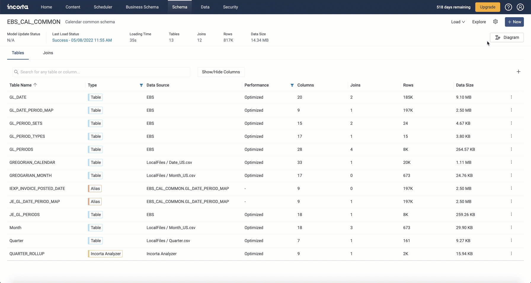
- External schemas are now collapsed and each displayed as a node by default.
- Collapsed schema nodes show the physical schema name and the number of collapsed items (linked objects).
- You can expand collapsed schema nodes to show the linked objects.
- For collapsed schema nodes, all join arrows that relate to the same object in the current schema are combined in only one arrow.
- The diagram legend displays a key for external schemas with their number.
- Searching for an object in a collapsed schema node expands the node and sets the focus on the related object.
- Selecting the arrow from or to a collapsed schema node opens the details drawer with all related join relationships listed. You can manage the join relationships if the child object exists in the current schema.
- A visual indication appears when you hover over the node of an object in the current schema denoting that you can draw an arrow from this object to create a new join relationship.
Component SDK: Numeric Range Slicer
From the Component SDK Marketplace, you can add this optional external component to dashboards. This Numeric Range Slicer is a list or range selector created in the Analyzer.
When creating your range slicer, in the Analyzer, you select one or more distinct date or numerical values from a dimension column. The selector will be displayed in the dashboard and act as a visual filter on the dashboard. Applying changes to the selector will filter applicable insights based on the selected dimension value(s).