Guides → Analyze
Incorta presents an opportunity to analyze data in a new way. To Analyze is to practice Agile Analytics. Agile Analytics is a paradigm for exploring data that focuses on finding value in a dataset rather than proving hypotheses by using a free-form adaptive approach. When paired with a powerful data visualization tool like Incorta, it can be an excellent paradigm for analysts.
Here are the core steps for analyzing data, along with key Agile Analytics principles:
- Ask yourself: Why Analyze? Find the reasons why the stakeholders want to analyze the data. Welcome changing requirements, even late in development.
- Understand the Data: Learn the terminologies and patterns in the data.
- Analyze the Data: Iteratively find the latent variables, choose the subsets and answer the data questions.
- Visualize the Data: Create the graphs and visualizations to make understanding easier. Provide early and continuous delivery of valuable working and deployable analytics.
- Present the Data: Show your results in an accessible manner, and provide conclusions and recommendations. Collaborate with stakeholders throughout the project, and adapt to frequent feedback.
Agile Analytics is a development style, not a prescriptive methodology that tells you precisely what you must do and how you must do it. The dynamics of each project within each organization require practices that can be tailored appropriately to the environment.
Build a Visualization
Now that you have created a repository of your data using Incorta’s Connectors, and built a schema using the Schema Wizard or Schema Designer, it is time to build a visualization with the Analyzer.
With the Analyzer, you can explore one or more schemas and analyze the data in the schema using a visualization. You can save a visualization as an insight on a new or an existing dashboard. In addition, the Analyzer allows you to create formulas and calculations with the Formula Builder.
There are at several ways to invoke the Analyzer:
- In the Schema Designer for a given schema, in the Action bar, select Explore Data.
- In Content, in the Action bar, select + New, and in the Add New menu, select Add Dashboard.
- For an existing Dashboard, to add a new Insight, in the Action bar, select +.
- For an existing Insight on a Dashboard, in the Action menu
- select Edit (pen icon).
- or, select More Options (⋮ vertical ellipsis icon), and in the More Options menu, select Edit.
- When creating or editing an Incorta Analyzer Table in a physical schema, select Edit (pen icon).
- When creating or editing an Incorta Analyzer View in a business schema
With the Analyzer, you can build a dashboard consisting of one or more insights. An insight is a visualization that explores one or more schemas or business schemas. The goal of the insight is to help drive decisions and fuel curiosity in your organization.
Select Data
After invoking the Analyzer, the first step is to select the data to build the visualization. Here are the steps to select data:
- In the Data panel, select Manage Dataset.
- In the Manage Data Sets panel, select the Views or Tables tab to add the desired views or tables to the Data panel. You can also use the Search bar to filter the available views and tables. Select the checkbox at the highest level of the branch to include all views or tables in that branch, or select individual views or tables.
- Select X in the Manage Data Sets panel or click on the Visualization canvas to close the Manage Data Sets panel.
- Once the data is selected, you can use the Search bar to filter the data available. You can also use the down arrow in the search bar to filter the data to a particular type (string, numerical, date, timestamp, boolean or key only).
Select an Insight Type
After selecting data for the visualization, choose an insight type. In the Insight panel, use the drop down list to select the desired insight type.
Add Groupings, Measures, and Filters
Based on the insight type chosen, the trays available in the Insight panel will change. Here are the actions you can take in the Insight panel:
- Drag and drop the desired columns or formulas from the Data panel to the Measures tray.
- Add a Grouping dimension to the visualization.
- Add a Coloring dimension to the visualization.
- Add an Individual, Aggregate, or Distinct filter to the visualization.
- Add a Sort to the visualization.
Set Pill Properties
A column or formula in a tray is a Pill. Each pill has configurable properties. The parent tray determines the available properties of a pill. Select the arrow to the right of the pill name to view the Properties panel and set the pill properties.
Create a Formula for an Insight
Often, business users and analysts want to create a calculation for an insight on a dashboard. With the Formula Builder, you can create mathematical calculations and programmatic expressions. To create a calculation in an insight, follow these steps:
- In the Data panel of the Analyzer, select Add Formula.
- Drag and drop the New Formula to the Measure tray, which opens the Formula Builder.
- With the Formula Builder, use data columns, built-in functions, and variables to create the calculation in the Formula Editor.
- Select Validate & Save in the Formula Builder.
- Double click New Formula in the pill to enter the Name of the formula.
- Set the other formula properties as needed, such as a format for the calculation (e.g. Dollar Rounded).
- In the Analyzer, in the Action bar, select Save to save the changes to the insight.
Save the Insight in a New or Different Dashboard
When you select Save in the Analyzer, the insight changes are saved to the dashboard you are currently using. Another option is to save the insight changes to a new or different dashboard with the following steps:
- In the Analyzer, in the Action bar, select V to the right of Save.
- In the drop down menu, select Save as Insight…
- In the Save as… dialog, select a folder, dashboard, or tab to save the insight to. You can search or filter the dashboards and folders by entering a string in the Search bar.
- When you select a folder, an Add Dashboard dialog appears. Enter a name for the new dashboard and select Add. You can also add a new folder by selecting an existing folder in the tree, and then selecting New Folder in the bottom left corner of the dialog. In the Add Folder dialog, enter a folder Name and select Add.
- When you select a dashboard, the insight will be saved at the bottom of the first dashboard tab.
- When you select a tab, the insight will be saved at the bottom of the tab. You can also add a new tab by selecting an existing dashboard in the tree, and then selecting New Tab in the bottom left corner of the dialog. In the Add Tab dialog, enter a tab Name and select Add.
- Select Save.
Enhance the Visualization
As a visualization creator, there are several actions you can take in the Properties panel to enhance the appearance and effectiveness of the information presented. These actions include:
- Sort the data
- Add a conditional format
- Drill down within an insight
- Drill down to another dashboard
Sort the Data
Depending on the visualization type for the insight, there are two ways to sort data:
- Use Sort By in the Insight panel. This option is available for Listing and Aggregated tables only, in which all columns or formulas are in the Measure tray.
- Drag and drop the measure you would like to use to sort the data in the Sort By tray.
- Select the arrow next to the measure name to sort ascending (up arrow) or descending (down arrow). The default is a descending sort.
- Use Sort By in the Properties panel. Some columns can be sorted depending on the insight type, and the tray the column or formula is in. For example, in a Bar chart, when a column is added to the Grouping Dimension tray, Sort By appears as a property.
- Drag and drop the column or formula you would like to use to sort the data in the Drag columns/formulas here area.
- Select the arrow next to the column or formula name to sort ascending (up arrow) or descending (down arrow). The default is a descending sort.
For each sort option, it is possible to sort by more than one column. The sort precedence is based on the order of the columns, with the column at the top receiving the highest precedence.
Add a Conditional Format
Certain visualization types allow you to add one or more conditional formats based on the value or aggregated value of the measure itself or another measure. These visualization types are Listing Table, Aggregated Table, Pivot Table, KPI, Bar, and Column. For example, you may want to change the color of a data point to green if it denotes a positive result, or red if it denotes a negative result. In addition, you can add one or more formats based on the value or aggregated value of another measure.
For the aforementioned visualization types, here are the steps to add conditional formatting:
- Open the Properties panel for a measure column or formula.
- To base the conditional formats on the value or aggregated value of the measure itself, leave the Based On section blank.
- To base the conditional formats on another measure, do the following:
- Drag a column or a formula to the Based On section; the pill properties panel opens.
- For a formula, add the formula expression.
- Select the aggregation function. Not available for measures in a Listing Table insight.
- Select + Add Condition.
- In the Conditional Formatting panel, specify the following:
- Column Label
- Operator: <, ≤, =, ≠, >, or ≥
- Value: Enter a threshold value that triggers conditional formatting.
- Background: Select the background color to apply to the measure when the condition is true.
- Text Color: Select the text color to apply to the measure when the condition is true.
The Conditional Formatting feature is available for Bar and Column visualizations starting the 2022.5.0 release only when you add one measure pill and no coloring dimension pills. Conditional formatting based on another measure is available for all the aforementioned visualization types starting 2022.9.0.
Using a SQL view column as the base of conditional formatting is not supported.
Drill Down within an Insight
You can drill down to a lower level of detail within an insight. For example, you may have a Bar chart that shows the gross margin percent by product category. You may want to also see the gross margin percent for each product within the product category. You can do so by adding multiple columns to the Grouping Dimension tray to represent a hierarchy. In this example, you would add the product category column to the Grouping Dimension tray first, and then the product column to the Grouping Dimension tray. This does not change the appearance of the insight, which is grouped by product category. However, when one of the product category bars is selected, the insight will show the gross margin percent for all the products in the product category.
Drill Down to Another Dashboard
You can drill down from one dashboard to another. Here are the steps to add a dashboard drill down:
- Open the Properties panel for a measure column.
- Select + Add Dashboard in the Drill Down section.
- In the Add Dashboard panel, navigate the dashboard content tree to select a dashboard tab to drill down to. You can also use the Search bar above the tree to filter the dashboard content.
- Enable the Include Runtime Filters toggle to pass a filter from one dashboard to another.
More Insight Options
Focus an Insight
Enlarge an insight to full screen, and view the remaining insights on a tab one by one as follows:
- Select More Options (⋮ vertical ellipsis icon) for the insight.
- Select Focus.
- Select the right or left arrows in the Action bar to view the other insights on a tab in full screen mode.
Download an Insight
- Select More Options (⋮ vertical ellipsis icon) for the insight.
- Select Download as.
- Select the download file format:
- For chart insight types, the options are PNG, JPEG, PDF, and SVG.
- For table insight types, the options are XLSX and CSV.
Print a Chart Insight
For chart insight types only, print the insight as follows:
- Select More Options (⋮ vertical ellipsis icon) for the insight.
- Select Print Chart.
- Select Print.
View Chart Insight as a Table
For chart insight types only, view the chart as a table as follows:
- Select More Options (⋮ vertical ellipsis icon) for the insight.
- Select View as Table.
- Select the table type. The options are:
- Regular
- Aggregated
View the insight lineage
Starting with 2023.7.0, you can view the data lineage of each insight on the dashboard. The Data Lineage Viewer v2 displays the entities (tables, views, variables, and columns) that the insight references.
- For the insight you want, select More Options (⋮ vertical ellipsis icon).
- Select Open Lineage. The Data Lineage Viewer v2 opens displaying the data lineage diagram of the insight.
Delete an Insight
- Select More Options (⋮ vertical ellipsis icon) for the insight.
- Select Delete.
- In the dialog, select Delete.
Set an Insight Alert
- Select More Options (⋮ vertical ellipsis icon) for the insight.
- Select Set Alert. Refer to the Scheduler document for additional information on Data Alerts.
Add an Insight to a Dashboard
The following steps are applicable till Incorta version 2023.1.0. Starting 2023.4.0, Incorta introduced new enhanced experience, please refer to the Dashboard Manager document for the changes.
Add a New Insight
Add a new insight to a dashboard as follows:
- For a new dashboard, select + Add Insight in the Insight canvas.
- Or, select + in the Action bar.
Copy an Insight from one Dashboard to Another
Copy an insight from one dashboard to another as follows:
- For the insight you would like to copy, select More Options (⋮ vertical ellipsis icon).
- In the More Options Menu, select Copy.
- To paste the insight:
- For a new dashboard, select Paste Insight in the Insight canvas.
- Or, select + → Paste Insight in the Action bar.
Duplicate an Insight within a Dashboard
Duplicate an insight within a dashboard as follows:
- For the insight you would like to duplicate, select More Options (⋮ vertical ellipsis icon).
- In the More Options Menu, select Duplicate. The insight is duplicated at the bottom of the active dashboard tab.
Engage the Audience with the Dashboard
As the dashboard creator, there are several ways for you to engage the audience of your dashboard in order to initiate collaboration on the analytics presented. The following are ways to engage the audience:
- Share the dashboard
- Sent the dashboard as an email
- Schedule delivery of the dashboard
- Configure filters, prompts and variables
Share the Dashboard
Share a dashboard with other users, email addresses, or groups, and provide them with either View, Share or Edit access to the dashboard. Here are the steps to share a dashboard:
- Select the Share icon in the top right corner of the dashboard page.
- Select Share Access.
- In the Share dialog, in the With: field, enter the name of the user, email address, or group you would like to share the dashboard with, and select it from the results.
- Select the eye icon to the right of the With: field to set the access level as Can View, Can Share, or Can Edit. The default value is Can View.
- Select Share.
- Select Close.
Send or Schedule Delivery of the Dashboard
Schedule delivery of the dashboard to send the dashboard to other users, email addresses, or groups, or send dashboards to data destinations. Set up the delivery of the dashboard on a recurring basis to proactively share dashboard updates with the recipients or send the dashboard right away.
Here are the steps to schedule delivery of the dashboard:
- Select the Share icon in the top right corner of the dashboard page.
- Select Send/Schedule a Report.
- In the Schedule page, enter the dashboard schedule and delivery properties.
- Select the delivery channel: Email or Data Destination, and then enter the dashboard email properties or the dashboard data destination properties respectively.
- Select Done.
To send the dashboard right away, select Done without defining the dashboard schedule options.
Dashboard schedule and delivery properties
| Property | Control | Description |
|---|---|---|
| Name | text box | Enter the schedule name. The default is the name of the dashboard. |
| Add Description | link | Select this link to expose a Description text box. |
| Description | text box | Select Add Description to configure this property. Enter a description of the dashboard schedule. |
| Paste summary | link | Select Add Description to configure this property. Populate the description field with the auto-generated schedule description that appears at the top of the Schedule page (e.g. Delivering Sales Overview Dashboard every week at 8:00 AM as HTML via Email). |
| Every | text box, drop down list | Enter the number representing the time period frequency in which dashboard delivery should occur. Select the time period. The options are: ● Minute(s) ● Hour(s) ● Day(s) ● Week ● Month(s) |
| No recurrence | checkbox | Select this checkbox to deliver the dashboard one time only. |
| At | time picker, drop down list | Select the hour, minute, meridiem, and time zone at which to deliver the dashboard. Select Now to deliver the dashboard immediately. |
| From | date | Select the from and to date between which delivery of the dashboard should occur. |
| Does Not End | checkbox | Select this checkbox to deliver the dashboard indefinitely at the scheduled time. |
Dashboard email properties
| Property | Control | Description |
|---|---|---|
| Recipients | text box | Enter the user, email address, or group to send the dashboard to. Select the recipient from the search results and select Enter. Select To, Cc, or Bcc to the right of the recipient name. Select the X to the far right of the recipient name to delete the recipient. |
| Export Folders → File Name | text box | Enter the file name you would like to export the dashboard to. The default is the dashboard name. |
| Export Folders → Append Tab Name | checkbox | Append the dashboard tab name to the specified file name, and use the result as the name of the exported file. This property is checked by default. |
| Export Folders → Append Timestamp | checkbox | Append a timestamp to the specified file name, and use the result as the name of the exported file. This property is checked by default. If you uncheck this property, the exported file will overwrite any existing file in the export folder with the same name. |
| Export → To | text box | Enter the name of the folder you would like to export the dashboard to. You must first specify the Export Folder in the CMC Tenant Configurations. |
| Subject | text box | Enter the email subject. The default is the name of the dashboard. |
| Paste schedule name | link | Select this link to replace the content of the subject line with the dashboard name. |
| Included Tabs | text box | Select the tabs to include. The default is the selected tab. |
| Include all tabs | checkbox | Select this checkbox to include all dashboard tabs in the email. |
| Choose Bookmark | drop down list | Select one of your private bookmarks or a public one to apply its filters to the dashboard before sending it. This feature is available when sending dashboards as PDF or HTML only. See Manage Dashboard Bookmarks for more details. |
| Show bookmark filters | checkbox | Select this checkbox to reveal the values of the selected bookmark filters in the delivered file. This property is available when you select a bookmark. |
| Data Format | button | Select the data format of the email. The options are: ● HTML ● HTML File ● XLSX ● CSV |
| Body | text box | Enter the body of the email. |
| Hide notification text | checkbox | Select this checkbox to hide the auto-generated text sent with the email that includes sender name, dashboard name, and the filters applied to the dashboard (for CSV/XLSX formats). |
| Use HTML | checkbox | Select this checkbox to use a HTML email body instead of plain text (inline CSS styles only). |
Dashboard data destination properties
| Property | Control | Description |
|---|---|---|
| Data Destination | drop down list | Select one of the data destinations defined in the system. |
| Directory | button | Select one of the directories in the selected data destination to send the dashboard to. |
| Format | drop down list | Select the format of the sent file. The options are: ● XLSX ● CSV ● TXT |
| File Name | text box | Enter the file name you would like to export the dashboard to. The default is the dashboard name. |
| Append Timestamp | checkbox | Append a timestamp to the specified file name and use the result as the name of the exported file. |
For more details about the supported visualizations to send to data destinations and other limitations, refer to Concepts → Data Destination
Configure filters, prompts, and variables
You can configure how business users interact with a given dashboard and the various insights on the dashboard using filters, prompts, and variables. Configure filters for dashboards and insights in order to drive the data curiosity of business users who only have view access to dashboards. By default, all dimensions are available to apply as dashboard runtime filters.
Runtime Filters
The default behavior of a dashboard without any preconfigured dashboard filters is to coalesce all exposed dimensions from all insights on the dashboard into a list of column filters. In the dashboard Filter bar, there are controls and components that present this list of coalesced dimensions as column filters.
Prompts
Prompts control the available column filters exposed in the Filter bar. In other words, only defined prompts appear in the Filter bar and any previously exposed column filters are no longer available.
To create a Prompt for a given dashboard, follow these steps:
- In the Action bar, in More Options (⋮ vertical ellipsis icon), select Manage Dashboard Filters.
- From the Data panel, select a column in the tree.
- To add the selected column to the Runtime Filters tray, drag and drop the column.
- In the Action bar, select Done.
Prompt Configuration Support
Prompts support a variety of configurations:
- One or more columns can be specified as prompts
- Selected columns can be Keys, Dimensions, and Measures
- A formula can be a prompt
- Columns and formulas can be of any data type
- A business schema view formula column can also be a prompt
Prompt: Default Filter property
Without configuring the properties of a Prompt filter, the default behavior is for the dashboard to override the existing column filter list with the list of prompts as dashboard filters. Both Search and the Filter dialog show the prompts as column filters.
A Default Filter property specifies the filter expression for the column or formula. A filter expression for a column prompt consists of the selected column, selected filter operator, and selected values. A filter expression for a formula prompt consists of the formula expression as a filter expression that evaluates to either true or false.
Once enabled, prompts with default filters will be enabled on the dashboard Filter bar. A user may edit, remove, or clear prompts with default filters. As a dashboard opens for the first time, the dashboard restores the prompts with default filters.
To set a Default Filter for a prompt, follow these steps:
- Open the Properties menu for the Prompt.
- Enable the Default Filter toggle.
- In the Filter Expression menu, select the filter operator.
- In the Filter Expression menu, select a filter value.
- In the Filter Expression menu, to save the filter expression, select Filter.
- In the Action bar, select Done.
Certain filter operators afford various options for selecting one or more filter values. For example, the In and Not In filter operators allow for the selection of none, one or more, or all filter values.
Prompt: Mandatory Filter property
Before the Mandatory Filter property becomes available to enable, a prompt must specify a Default Filter property.
Prompts with mandatory filters cannot be removed or cleared from the Filter bar. A user may change the selected filter value, but cannot remove the filter itself.
To set the Mandatory Filter property for a prompt, follow these steps:
- Open the Properties menu for the Prompt.
- Enable the Mandatory Filter toggle.
- In the Action bar, select Done.
Prompt: Hierarchy property
The Hierarchy property is relevant for tables with self-referential joins. Once enabled, a level must be specified.
Applied Filters
An applied filter is a dashboard filter that affects all related insights on a dashboard by filtering the dashboard data by the specified filter expression.
Applied filters are not visible to dashboard users who have only view permissions to the dashboard. Users with edit permissions will only see an applied filter configuration when viewing the Dashboard Filters in Manage Dashboard Filters.
To create an Applied Filter for a given dashboard, follow these steps:
- In the Action bar, in More Options (⋮ vertical ellipsis icon), select Manage Dashboard Filters.
- From the Data panel, select a column in the tree.
- To add the selected column to the Applied Filters tray, either drag and drop the column or select + in the gutter.
- For a column filter, set the filter expression.
- In the Action bar, select Done.
Applied Filter Configuration Support
Applied Filters support a variety of configurations:
- One or more columns can be specified as applied filters
- Selected columns can be Keys, Dimensions, and Measures
- A formula can be an applied filter
- Columns and formulas can be of any data type
- A business schema view formula column can also be an applied filter
Properties for an Applied Filter using a Column
An applied filter specifies the filter expression for the specified column or for a formula. A filter expression for a column consists of the selected column, selected filter operator, and selected values.
To set the properties for an Applied Filter that uses a column, follow these steps:
- Open the Properties menu for the column that is an Applied Filter.
- In the Properties menu, select Edit Operator / Value(s).
- In the Filter Expression menu, select the filter operator.
- In the Filter Expression menu, select a filter value.
- In the Action bar, select Done to save.
Certain filter operators afford various options for selecting one or more filter values. For example, the In and Not In allow for the selection of none, one or more, or all filter values.
Properties for an Applied Filter using a Formula
A filter expression for a formula that is an applied filter is more complex. A formula as an applied filter can be dynamically evaluated using a filter expression. For example, with the Dynamic property enabled, a filter expression session variable must be selected.
Variables
A variable stores a value of a specific data type. For example the variable X is an integer and stores only positive and negative whole numbers. A variable typically has a default value for initialization, for example, X=1.
Some variables are mutable, meaning the values they store can change during the scope of a user session. There are two types of mutable variables in Incorta: Presentation Variables and Session Variables.
Variables that are immutable, meaning the Incorta Analytics service initializes the variable with an initial value that cannot be changed, are System Variables.
Session variables
The user session defines the scope of a Session variable.
When a user signs in to a tenant, the Incorta Analytics Service creates a user session. A user session has access to all System Variables, including the special user system variable. The user system variable is a special system variable that stores the login name for the user.
Only when a user interaction invokes a session variable, such when a user opens a dashboard that references a session variable, does the Analytics Service assign a value to the invoked session variable.
The session variable, and its value, only exists within the scope of the user session. When a user signs out of Incorta, the Analytics Service evicts all related user session variables from memory.
System Variables
Besides the user system variable, all exposed System Variables are of the type Date. As System Variables, the system date variables have the widest scope of all three types of variables. The scope of system variables is for all users and all services.
For example, when the Incorta Service starts, the services initialize all system date variables. System Variables are immutable in the sense that only the Incorta services can assign a value to a System Variable.
Presentation Variables
Defined in Dashboard Filters, presentation variables only exist within the scope of the given dashboard and the user interacting with the dashboard. Presentation variables are mutable by design, meaning user interactions can set the value of the variables. When a user leaves the dashboard, the Analytics Service evicts the presentation variable from memory.
Presentation Variables exhibit similar behavior as Prompts in the Filter bar. The default behavior is for the dashboard to override the existing column filter list with the list of presentation variables for the dashboard filters. Unlike Prompts, only the Filter dialog shows the presentation variables as column filters.
To create a Presentation Variable for a given dashboard, follow these steps:
- In the Action bar, in More Options (⋮ vertical ellipsis icon), select Manage Dashboard Filters.
- From the Data panel, drag and drop New Variable to the Presentation Variables tray.
- In the Properties menu, specify the presentation variable properties.
- In the Properties menu, select Done.
- To save, in the Action bar, select Done.
Presentation Variable Usage
By itself, a presentation variable is simply a variable for a user to set a value for in the dashboard Filter bar. Selecting a presentation variable in the Filter bar invokes the Filter dialog, and that's it. By itself, the presentation variable does not filter or affect the dashboard.
There are several ways to use the presentation variable as both a default value and dynamic value in a dashboard:
- Create an Applied Filter using a column and set the filter value in the filter expression to the value of the presentation variable
- Create an Applied Filter using a formula and in the filter expression use the presentation variable value
- Create an Insight Filter using a column and set the filter value in the filter expression to the value of the presentation variable
- Create an Insight Filter using a formula and in the filter expression use the presentation variable value
- For an insight, create a formula column in a tray, and in the formula expression use the presentation variable value
- Create a Measure Filter using a formula and in the formula expression use the presentation variable value
- In the Properties menu for a measure in an insight, for a supported property, use the presentation variable as a dynamic value
Presentation Variable Usage: Applied Filter
To create an Applied Filter using a column and to set the filter value in the filter expression to the value of the presentation variable, follow these steps:
- In the Action bar, in More Options (⋮ vertical ellipsis icon), select Manage Dashboard Filters.
- From the Data panel, select a column in the tree.
- To add the selected column to the Applied Filters tray, either drag and drop or select + in the gutter.
- In the Properties menu, select the Edit Operator / Value(s).
- In the Filter Expression menu, select the filter operator.
- In the Filter Expression menu, in the Search / Add text box, manually enter the reference to the presentation variable using the $ symbol, e.g, $pv_VariableName.
- Press Enter or Return to save the manually entered reference to set the filter expression.
- In the Action bar, select, Done.
- In the dashboard, in the Filter bar, verify the behavior of the presentation variable and applied filter.
Presentation Variable Usage: Dynamic Value for a Measure Property
To use a presentation variable as a dynamic value for a supported property of a measure, follow these steps:
- In the Action bar, in More Options, select Manage Dashboard Filters.
- From the Presentation Variable tray, select +Add.
- In the Properties menu, specify the presentation variable properties.
- In the Properties menu, select Done.
- To save, in the Action bar, select Done.
- In the Action menu for the insight, select Edit (pen icon).
- In the Analyzer, for the measure, open the Properties menu.
- Select + Add Conditional Format.
- For the Operator property, select a comparison operator.
- For the Value property, manually enter the reference to the presentation variable using the $ symbol, e.g, $pv_VariableName.
- For Text Color, select a color
- Select Save.
- Verify the behavior of the measure on the insight with regards to values set for the presentation variable dashboard filter.
Presentation variable properties
| Property | Control | Description |
|---|---|---|
| Display Name | text box | Enter the name the dashboard users will see in the filter bar. |
| Variable | text box | Enter the name of the variable that is referenced with a $ sign. |
| Data Type | drop down list | Select the data type of the presentation variable. The options are string, double, long, integer, or date. |
| Default Value | text box | Enter the default value of the presentation variable. This is required for initialization and must match the selected Data Type. |
| Field (Optional) | drag and drop | Optionally drag and drop a column from the Data panel. The distinct column values will show as selection choices for the given presentation variable. |
Insight Filters
Use an Insight Filter to filter a specific insight on a dashboard. There are three types of Insight Filter configurations:
- Filter Individual Values
- Filter Aggregate Values
- Distinct Filter
Individual Filter
The Individual Filter is equivalent to a WHERE clause in SQL. A WHERE clause in a SQL query filters the rows in a query that are being returned. Rows that do not meet the condition will not be returned in the query.
An Individual Filter supports using a column or a formula as a filter. The column can be a key, a dimension, or a measure. For a formula, you simply specify a filter expression.
An example of usage is an insight that shows Revenue by Country. In this example, the insight visualization is an aggregated table. Using an Individual Filter, you can specify a column filter that only returns rows where the Country is Canada.
Aggregate Filters
The Aggregate Filter is equivalent to a HAVING clause in SQL. A HAVING clause in a SQL query does not restrict the rows being returned, but rather filters the summarized results.
An Aggregate Filter supports using a column as a filter. The column can be a key, a dimension, or a measure. Typically, the column is a measure.
An example of usage is an insight that shows Revenue by Country where the aggregated revenue is greater than or equal to a specific sum.
Distinct Filter
You can use a Distinct Filter to show only distinct values. Only the Table visualization supports the Distinct Filter. In terms of SQL, the Distinct Filter is synonymous with the SELECT DISTINCT statement.
A Distinct Filter supports using a column as a filter. The column can be a key, a dimension, or a measure.
An example of usage is an insight that shows Distinct Products from a Transaction Table. Without the filter, the table shows more than 9 million rows. With a Distinct Filter, the table shows 266 rows.
Measure Filter
Use a Measure Filter to filter a specific measure on an insight on a dashboard. Only aggregated visualizations support Measure Filters. Table visualizations do not support Measure Filters unless configured to be an Aggregated Table.
A Measure Filter supports using a column or a formula as a filter. The column can be a key, a dimension, or a measure. For a formula, you simply specify a filter expression or configure a dynamic evaluation of a filter expression session variable.
Unlike dashboard and insight filters, a measure filter does not filter out rows from the insight query itself. In other words, a measure filter does not reduce the data for the visualization.
A typical example for using a Measure Filter is to show the same measure, such as Revenue, multiple times on a specific insight. For example, 2020 Revenue, 2021 Revenue, etc.
Preview the Variable Value
When you apply a filter to your dashboard from the Filter dialog, you may preview the value of session and system variables. You will find this feature useful when identifying the correct variable value for your filter. You should have knowledge of a session variable, system variable, and managing dashboard filters when using this feature.
Steps to preview a variable value
- In the Navigation bar, select Content.
- Select a dashboard that is using a dashboard filter.
- In the Filter dialog, select a filter.
- In the Search bar, enter a system variable or session variable name.
- On the right side of the search dialog, select Preview (magnifying glass icon) for a variable.
When you search for variables, the variable name should be preceded by a $ in your search.
Customize the Dashboard
Make the dashboard your own! Regardless of whether you are a creator or end user, there are several ways to customize the dashboard to fit your specific needs. You can:
- Personalize the dashboard by reorganizing and resizing the insights
- Bookmark the dashboard to save the views and settings of dashboards you use often
Personalize the Dashboard
Select Dashboard Insights
Use the Edit Layout panel to select the insights to include on your dashboard with the following steps:
- Open the Edit Layout panel with one of these two options:
- Select Personalize (page icon) in the upper right corner of the dashboard page, select Personalize and Select Insights in the Context bar.
- Select More Options (⋮ vertical ellipsis icon) → Personalize to the right of the tab name on the active dashboard tab, and Select Insights in the Context bar.
- In the Selected Insights panel to the right of the insights, select or deselect the insights to include or exclude from the dashboard, respectively. By default, all insights are included.
- Select the Save button.
Edit the Dashboard Layout
Use the Edit Layout panel to move and resize insights on your dashboard with the following steps:
Open the Edit Layout panel with one of these two options:
- Select Personalize (page icon) in the upper right corner of the dashboard page, and Edit Layout in the Context bar.
- Select More Options (⋮ vertical ellipsis icon) → Personalize to the right of the tab name on the active dashboard tab, and Edit Layout in the Context bar.
Move the selected insight with the options below:
- Drag and drop: Drag and drop the insight to the desired area of the dashboard.
- Move arrow buttons: Select the move arrow button in the Edit Layout panel that represents the direction you would like to move the insight.
Note- If the insight is at the top of the dashboard, only the down arrow button is enabled.
- If the insight is at the bottom of the dashboard, only the up arrow button is enabled.
- If the insight is not side by side with another insight, only the up and down arrow buttons are enabled.
Resize insights in a dashboard using the following methods:
- For multiple insights within the same row, drag and drop the horizontal border line to resize all insights in that row.
- For a single insight, drag and drop the vertical border line to resize that particular insight.
Select the Save button.
Edit Insight Settings
Use the Edit Layout panel to select the columns to include in the insight (table visualizations only) with the following steps:
- Open the Edit Layout panel with one of these two options:
- Select Personalize (page icon) in the upper right corner of the dashboard page, and Edit Insight Settings in the Context bar.
- Select More Options (⋮ vertical ellipsis icon) → Personalize to the right of the tab name on the active dashboard tab, and Edit Insight Settings in the Context bar.
- Select a table insight on the dashboard.
- In the Table Columns panel, select or deselect the measures to include in the insight. All measures are included by default.
- Select the Save button.
Manage Dashboard Bookmarks
After you run filters on a dashboard, you can add a bookmark to the dashboard to save a dashboard filter for later use. Starting the 2022.10.0 release, you can create scheduled jobs to deliver a dashboard as PDF or HTML to export folders or via email while applying a selected bookmark. You can also select to reveal the bookmark name and the values of the applied filters in the delivered files.
Add a bookmark
Here are the steps to add a bookmark:
- Select the Bookmark icon in the upper left corner of the dashboard.
- Select + Add Bookmark.
- Enter a Name for the bookmark.
- Optionally select the Set as Default checkbox, which will cause the filter to be applied to the dashboard when opened.
- Optionally select the Include Default Prompts checkbox, which will include the default prompts even if they are not part of the bookmark that is set as default.
- Optionally select the Make it Public checkbox, which will share the bookmark with users that have access to the dashboard.
- Select Add.
- Select Close.
Edit a bookmark
Here are the steps to edit a bookmark:
- Select the Bookmark icon in the upper left corner of the dashboard.
- Select the pen icon to the right of the bookmark you want to edit.
- Edit the bookmark name or options.
- Select Save.
Changing a bookmark from public to private suspends all related scheduled dashboard delivery jobs that other users created. However, the scheduled jobs that you created (as the bookmark owner) will run as usual.
Update the bookmark filters
You can update the filters of a bookmark and save these updates. When you update bookmarks that you or other users use in scheduled dashboard delivery jobs, these changes are applied in the next job runs.
Here are the steps to update the bookmark filters:
- Apply the filters you want on the dashboard.
- Select the Bookmark icon in the upper left corner of the dashboard.
- Select the bookmark with arrow icon to the right of the bookmark you want to update its filters. New filters will overwrite the bookmark saved filters.
- In the warning message, select Update. New filters will overwrite the bookmark saved filters.
Delete a bookmark
Here are the steps to delete a bookmark:
- Select the Bookmark icon in the upper left corner of the dashboard.
- Select the Delete (trash can) icon to the right of the bookmark you would like to delete.
- In the warning message, select Delete.
Deleting a bookmark that you or other users use in scheduled dashboard delivery jobs suspends the related scheduled jobs. You cannot resume a dashboard delivery job that has been suspended due to deleting a bookmark or changing it to private. You have to first update the scheduled job to remove the bookmark or select a valid one.
Additional Dashboard Options
Hide or Show the Dashboard Search and Filter Bar
- Select More Options (⋮ vertical ellipsis icon).
- If the Dashboard Search and Filter Bar is displayed, select Hide Search and Filters.
- If the Dashboard Search and Filter Bar is hidden, select Show Search and Filters.
Switch Between Relaxed and Compact Dashboard View Mode
- Select More Options (⋮ vertical ellipsis icon).
- If Relaxed Mode is active, select Switch to Compact Mode.
- If Compact Mode is active, select Switch to Relaxed Mode.
Configure Dashboard Settings
Configure dashboard properties and advanced settings as follows:
- Select More Options (⋮ vertical ellipsis icon).
- Select Configure Settings.
- Edit the dashboard configuration properties as necessary.
- Select Save.
Dashboard configuration properties
| Property | Control | Description |
|---|---|---|
| Name | text box | Enter the dashboard name. |
| Description | text box | Enter a description of the dashboard. |
| Open in Maximized View | checkbox | Select this checkbox to open one insight at a time. |
| Customize Color Palette | checkbox | Select this checkbox to customize the dashboard color palette. Options are: ● Classic ● Bright and Bold ● 90’s Retro ● Contemporary ● Custom This option also allows you to set a default hex value for common colors in each palette. |
| Enable Incremental Reporting | checkbox | Select this checkbox to enable incremental reporting. |
| Select date column | drop down list | With incremental reporting enabled, select a data column to use for incremental reporting. |
View the dashboard lineage
Starting with 2023.7.0, you can view the data lineage of the whole dashboard, as well as each insight. The Data Lineage Viewer v2 displays the entities (tables, views, and variables) that the dashboard references, whether entities that the dashboard insights reference or that the dashboard itself references in its filters and prompts.
- Select More Options (⋮ vertical ellipsis icon).
- Select Open Lineage. The Data Lineage Viewer v2 opens displaying the dashboard data lineage diagram.
Move a Dashboard
Move a dashboard to another folder as follows:
- Select More Options (⋮ vertical ellipsis icon).
- Select Move to…
- In the folder tree, navigate to the folder to move the dashboard to. You can filter the tree results by entering a search string in the Search text box. Optionally add a New Folder to add the dashboard to by selecting the New Folder button.
- Select Move.
Copy a Dashboard
- Select More Options (⋮ vertical ellipsis icon).
- Select Make a Copy.
- Optionally enter a New Name for the dashboard copy. The default is the name of the original dashboard with Copy appended to the end.
- In the folder tree, navigate to the folder to move the dashboard copy to. You can filter the tree results by entering a search string in the Search text box. Optionally add a New Folder to copy the dashboard to by selecting the New Folder button.
- Select Copy, or select Copy & Open if you would like to open the dashboard copy.
Export a Dashboard
Export the dashboard XML as follows:
- Select More Options (⋮ vertical ellipsis icon).
- Optionally select the Include Bookmarks and Include Scheduled Jobs checkboxes to include this information in the XML.
- Select Export.
Delete a Dashboard
- Select More Options (⋮ vertical ellipsis icon).
- Select Delete.
- In the dialog, select Delete.
For additional information on the actions that can be taken with dashboard tabs, refer to the Analyzer document.
Sales Overview Dashboard Example
In this example, you will learn how to build a Sales Dashboard that provides valuable insight into the performance of a company and its products. This example leverages the information presented earlier in the guide, and demonstrates how to apply this knowledge to real world scenarios.
In the Cluster Management Console (CMC), you can create a tenant that includes Sample Data. The Sample Data includes the SALES and date schemas. The following examples use these two schemas.
Create the dashboard
- In the Navigation bar, select Content.
- In the Action bar, select + New .
- In the Add New menu, select Add Dashboard.
- In the Add Dashboard dialog box, for Name, enter Sales Overview Dashboard.
- Select Add.
- For Tab 1, select More Options (⋮ vertical ellipsis icon) → Rename.
- Enter Overview, and press Enter or Return to save the new tab name.
Gross Margin Percent KPI
Create a KPI for company gross margin percent, applying a conditional format to display the KPI in green if Gross Margin Percent is greater than 50, or else in red.
Add an insight
- In the Insight canvas, select + Add Insight.
- In the Data panel, select Manage Dataset.
- In the Manage Data Sets panel, in Tables, select the SALES and date schemas.
- Close the Manage Data Sets panel.
- In the Insight panel, under Others, select KPI.
- From the Data panel, drag and drop Add Formula to the Measure tray.
- In the Formula Builder, enter the following:
sum(SALES.SALES.AMOUNT_SOLD - SALES.SALES.COST_OF_GOODS) / sum(SALES.SALES.AMOUNT_SOLD) - Select validate & Save.
- Change the name of the formula to Gross Margin Percent.
Edit the pill properties
- Select the arrow to the right of Gross Margin Percent to open the Properties panel.
- For Aggregation, select Formula.
- For Format, select Percent.
- In Conditional Formatting, select Add Conditional Format. In the Conditional Formatting panel,
- For Operator, select >.
- For Value, enter 50.
- For Text Color, select green.
- In Conditional Formatting, select Add Conditional Format. In the Conditional Formatting panel,
- For Operator, select ≤.
- For Value, enter 50.
- For Text Color, select red.
- Name the insight KPIs.
- In the Action bar, select Save.

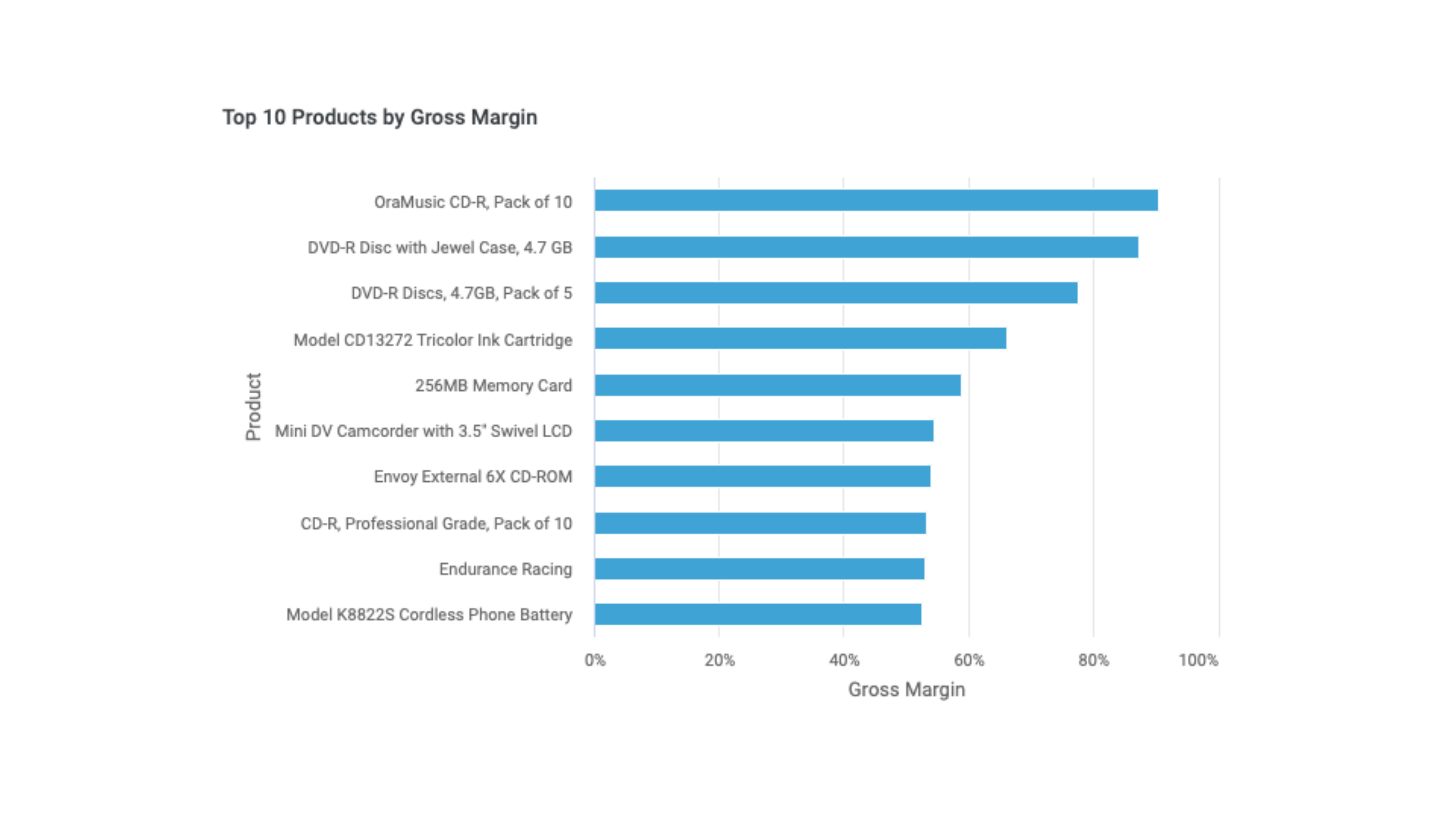
Top 10 Products by Gross Margin Percent
Create a bar chart that shows the Top 10 products by gross margin percent.
Add an insight
- In the Action bar, select +.
- In the Data panel, select Manage Dataset.
- In the Manage Data Sets panel, in Tables, select the SALES and date schemas.
- Close the Manage Data Sets panel.
- In the Insight panel, under Charts, select Bar.
- From the Data panel, drag and drop Add Formula to the Measure tray.
- In the Formula Builder, enter the following:
sum(SALES.SALES.AMOUNT_SOLD - SALES.SALES.COST_OF_GOODS) / sum(SALES.SALES.AMOUNT_SOLD) - Select Validate & Save.
- Change the name of the formula to Gross Margin Percent.
- From the Data panel, drag and drop Product to the Grouping Dimension tray.
Edit the pill properties
- Select the arrow to the right of Gross Margin Percent to open the Properties panel.
- For Aggregation, select Formula.
- For Format, select Percent.
- Select the arrow to the right of Product to open the Properties panel.
- From the Data panel, drag and drop Add Formula to the Drag columns/formulas here tray in Sort By. The default is to sort Descending, represented by a down arrow to the right of Gross Margin Percent.
- In the Formula Builder, enter the following:
sum(SALES.SALES.AMOUNT_SOLD - SALES.SALES.COST_OF_GOODS) / sum(SALES.SALES.AMOUNT_SOLD) - Select Validate & Save.
- Name the insight Top 10 Products by Gross Margin Percent.
Edit the insight settings
- In the Action bar, click Settings.
- In the Settings menu, set Max Rows to 10.
- In the Action bar, select Save.
Bottom 10 Products by Gross Margin Percent
Create a bar chart that shows the Bottom 10 products by gross margin percent.
Add an insight
- In the More Options (⋮ vertical ellipsis icon) menu for the Top 10 Products by Gross Margin Percent insight, select Duplicate.
- For the new insight, select the Edit (pen) icon.
- Select the arrow to the right of Product to open the Properties panel.
- In Sort By, select the arrow to the right of Gross Margin Percent to change it to an up arrow.
- Change the name of the insight to Bottom 10 Products by Gross Margin Percent.
- In the Action bar, select Save.

Profit and Gross Margin Percent by Year
Create a dual-axis chart that shows the Profit and Gross Margin Percent by Year.
Add an insight
- In the Action bar, select +.
- In the Data panel, select Manage Dataset.
- In the Manage Data Sets panel, in Tables, select the SALES and date schemas.
- Close the Manage Data Sets panel.
- In the Insight panel, under Charts, select Dual Axis.
- From the Data panel, drag and drop Add Formula to the Measure tray.
- In the Formula Builder, enter the following:
SALES.SALES.AMOUNT_SOLD -SALES.SALES.COST_OF_GOODS - Select Validate & Save.
- Change the name of the formula to Profit.
- In the Formula Builder, enter the following:
sum(SALES.SALES.AMOUNT_SOLD - SALES.SALES.COST_OF_GOODS) / sum(SALES.SALES.AMOUNT_SOLD) - Select Validate & Save.
- Change the name of the formula to Gross Margin Percent.
- From the Data panel, drag and drop Year to the Grouping Dimension tray.
Edit the pill properties
- Select the arrow to the right of Profit to open the Properties panel.
- For Format, select Dollar Rounded.
- For Color, select orange.
- For Type, select Column.
- Select the arrow to the right of Gross Margin Percent to open the Properties panel.
- For Aggregation, select Formula.
- For Format, select Percent.
- Name the Insight Profit and Gross Margin Percent by Year.
- In the Action bar, select Save.

Year over Year (YoY) Sales by Country
Create an aggregated table that shows the Year over Year (YoY) sales by country for the current year and prior year.
In order to create the Year over Year (YoY) Sales by Country insight, it is necessary to create an Alias table in the SALES schema so that a comparison of current and previous year sales can be made.
Here are the steps to create the Alias table for the Year over Year (YoY) Sales by Country insight:
- In the Navigation bar, select the Schema tab.
- In the Context bar, select Schemas.
- Select the SALES schema.
- In the Action bar, select + New → Alias.
- For Table Name, enter Atbl_Sales.
- For Selected Table, select SALES.
- Select Done.
Create a join between the Atbl_Sales and Date tables as follows:
- In the Action bar, select + New → Join.
- For the Child:
- The Schema is SALES.
- Select Atbl_Sales as the Table.
- Select TIME_ID as the Column.
- For the Parent:
- Select date as the Schema.
- Select date as the Table.
- Select year_ago_date as the Column.
- Select Done.
Add an insight
- Open the Sales Overview Dashboard.
- In the Action bar, select +.
- In the Data panel, select Manage Dataset.
- In the Manage Data Sets panel, in Tables, select the SALES and data schemas. For the Sales schema, ensure Atbl_Sales is selected.
- Close the Manage Data Sets panel.
- In the Insight panel, under Tables, select Aggregated Table.
- From the Sales table in the Data panel, drag and drop Revenue to the Measure tray.
- Change the name of Revenue from the Sales table to Current Year Sales.
- From the Atbl_Sales table in the Data panel, drag and drop Revenue to the Measure tray.
- Change the name of Revenue from the Atbl_Sales table to Previous Year Sales.
- From the Data panel, drag and drop Add Formula to the Measure tray.
- In the Formula field, enter the following:
sum(SALES.SALES.AMOUNT_SOLD - SALES.SALES.COST_OF_GOODS) / sum(SALES.SALES.AMOUNT_SOLD) - Select Validate & Save.
- Change the name of the formula to % YoY Growth.
- From the Data panel, drag and drop Country to the Grouping Dimension tray.
- From the Data panel, drag and drop Year to the Individual Filter tray.
- For Operator, select In.
- For Values, select the checkbox for 2009.
Edit the pill properties
- Select the arrow to the right of Current Year Sales to open the Properties panel.
- For Format, select Dollar Rounded.
- Select the arrow to the right of Previous Year Sales to open the Properties panel.
- For Format, select Dollar Rounded.
- Select the arrow to the right of % YoY Growth to open the Properties panel.
- For Aggregation, select Formula.
- For Format, select Percent.
- Name the Insight YoY Sales by Country.
- In the Action bar, select Save.

New Customers by Year
Create a line chart that shows a trend of how many new customers are being acquired by year.
In order to create the New Customers by Year insight, it is necessary to create an Incorta Analyzer table in the physical schema so that the first sale date for each customer can be determined.
Here are the steps to create the Incorta table for the New Customers by Year insight:
- In the Navigation bar, select the Schema tab.
- In the Context bar, select Schemas.
- Select the SALES schema.
- In the Action bar, select + New → Derived Table → Incorta Analyzer.
- In the Data Source dialog, select Edit (pen icon).
- In the Analyzer, from the Sales table, drag and drop Customer Id and Sales Date to the Measure tray.
- Select Save.
- In the Data Source dialog, select Add.
- For Table Name, enter tbl_Earliest_Sales_Dates.
- Select Done.
Add an insight
- Open the Sales Overview Dashboard.
- In the Action bar, select +.
- In the Data panel, select Manage Dataset.
- In the Manage Data Sets panel, in Tables, select the SALES and data schemas. For the Sales schema, ensure tbl_Earliest_Sales_Dates is selected.
- Close the Manage Data Sets panel.
- In the Insight panel, under Charts, select Line.
- From the Sales table in the Data panel, drag and drop Customer Id to the Measure tray.
- Change the name of the Customer Id pill to # of New Customers.
- From the Data panel, drag and drop Year to the Grouping Dimension tray.
- From the Data panel, drag and drop Add Formula to the Individual Filter tray.
- In the Formula Builder, enter the following:
if(SALES.SALES.TIME_ID = SALES.tbl_Earliest_Sales_Date.Earliest_Sales_Date, 'New', 'Existing' ) = 'New' - Change the name of the formula to New Customer Indicator.
Edit the pill properties
- Select the arrow to the right of # of New Customers to open the Properties panel.
- For Aggregation, select Distinct.
- Select the arrow to the right of New Customer Indicator to open the Properties panel.
- For Operator, select True.
- Name the Insight # of New Customers by Year.
- In the Action bar, select Save.
