Visualizations → Percent Area
About a Percent Area visualization
A percent area visualization identifies the percentage contribution of individual parts as stacked colored areas in relation to all parts as a 100% running total, typically over a period of time. Each area of color represents one part of the whole where the parts are vertically stacked. The height of each colored stack represents the percentage proportion of a category at a given point in time in relation to the running total of all values in a category on the x-axis. The y-axis is always on a scale of 100%. For example, you can use a percent area visualization to show the percentage breakdown of sales for different products over fiscal quarters.
Although the percent area visualization does not depict absolute totals as a trend, it does highlight the comparison of relative contributions between nominal data and ordinal data especially over a period of time.The visualization also offers two baselines, across the bottom and top, which makes it easy to gauge the contribution of an individual group.Nominal data is categorical. The categories are arbitrary labels without numerical significance that function to describe calculated values. Ordinal data is the calculated percentage values of the categories.
The distinction between a percent area visualization and a percent area insight is that an insight is an instance of the visualization. As an instance, a percent area insight has unique configurations that a dashboard developer determines for displaying a percent area chart on a dashboard tab. Insight configurations affect the available user interactions for a dashboard consumer such as the ability to drill down into a grouping dimension and/or coloring dimension.
With three possible dimensions, a percent area visualization offers a dashboard developer the ability to create an insight that groups one or more aggregated values by one or more attributes. The result is a percent area chart on a dashboard tab that shows:
- a grouping dimension as the labels along the x-axis (horizontal axis)
- a coloring dimension as area colors
- a measure as percentage along the y-axis (vertical axis)
Configurations for a percent area insight
A dashboard developer first selects a percent area visualization for an insight in the Analyzer. Using the Analyzer, a dashboard developer configures pill properties, filter properties, and insight settings. Insight settings and pill properties determine not only how the percent area chart appears as an insight in a dashboard tab, but also how a dashboard consumer can interact with the percent area chart.
The visualization selection in the Insight panel of the Analyzer determines the available trays. From the Data panel, a dashboard developer adds a column or a formula to a tray. A column or a formula in a tray is a Pill.
Each pill has configurable properties. The parent tray determines the available properties of a pill.
The available trays for a percent area insight are:
A percent area insight requires at least one measure pill and one grouping dimension pill. Using a measure pill only without a grouping dimension results in an insight with one point that represents the percentage for this measure.
The Coloring Dimension tray is not available when there are two or more measure pills.
Grouping Dimension
From the Data panel, you can add a column or a formula to the Grouping Dimension tray. The percent area insight plots the first pill in the Grouping Dimension tray on the x-axis.
Each pill in the Grouping Dimension tray is a filterable column for the insight. The pill ordering in the grouping dimension tray defines the following:
- the first pill is the initial grouping dimension
- the other pills define an order of user interactions that allow a dashboard consumer to drill down into the next grouping and/or coloring dimension and in doing so, also create one or more dashboard runtime filters
Coloring Dimension
The Coloring Dimension tray is only available when there is only one measure pill.
From the Data panel, you can add a column or a formula to the Coloring Dimension tray. A coloring dimension is a third dimension that colors the areas in the chart. Each pill in the Coloring Dimension tray is a filterable column for the insight.
A defined coloring dimension introduces a Filter by menu as a user interaction for the percent area chart. With the Filter by menu, a dashboard consumer selects to filter the dashboard by:
- a grouping and a coloring dimension
- a grouping dimension
- a coloring dimension
The pill ordering in the coloring dimension tray defines the following:
- the first pill is the initial coloring dimension
- the other pills define an order of user interactions that allow a dashboard consumer to drill down into the next grouping and/or coloring dimension and in doing so, also create one or more dashboard runtime filters
Measure
To create an aggregation or calculation, you can add a column or a formula from the Data panel to the Measure tray.
A percent area insight shows the increments of the total percentage for the measure pill on the y-axis. A percent area insight with two or more measure pills does not support the definition of a coloring dimension.
You can select the measure pill to open the Properties panel. In the Properties panel, you can configure various properties such as the Aggregation and Format properties.
Individual Filter
To filter individual areas for the percent area insight, define an individual filter for the insight. You can add a column or a formula to the Individual Filter tray from the Data panel.
You can select the individual filter pill to open the Filter panel. Using the Filter panel, you can specify the filter operator, one or more filter values, or the filter expression itself with the Formula Builder. You can also disable the individual filter.
To learn more about filter expressions for an individual filter, review Concepts → Individual Filter.
Aggregate Filter
You can define a filter expression that contains an aggregation or calculation using the Aggregate Filter tray.
The Aggregate Filter tray is not available for a percent area insight with one or more coloring dimension pills.
To create a filter expression, you can add a column or a formula to the Aggregate Filter tray from the Data panel. You can select the aggregate filter pill to open the Filter panel.
Using the Filter panel, you can specify the aggregation, the filter operator, one or more filter values, or the filter expression itself with the Formula Builder. You can also disable the aggregate filter.
To learn more about filter expressions for an aggregate filter, review Concepts → Aggregate Filter.
Pill properties
The parent tray determines the available properties of a pill. There are various possible configurations for each pill type:
- Grouping dimension pill properties
- Coloring dimension pill properties
- Measure pill properties
- Individual filter properties for a filter expression
- Aggregate filter properties for a filter expression
You can edit the properties of a grouping dimension, coloring dimension, or a measure pill with the Properties panel for a percent area insight.
In order to create a filter expression, you can edit the properties of an individual filter or aggregate filter pill with the Filter panel.
In the case of the Filter property of a measure pill, you can open the Filter panel from the Properties panel in order to create the filter expression.
To open the Properties panel or Filter panel, select the pill arrow.
Grouping dimension pill properties
Here are the properties for a pill in the grouping dimension tray in a percent area insight:
| Property | Control | Description |
|---|---|---|
| Column fully qualified name | label | The fully qualified name of the selected column. This property is available only when you edit the properties of a column in the tray. Select the information icon (the letter i in a circle) to preview the column function (dimension, key, or measure) and samples of the column data. You can also use the Copy Column Name option (two paper sheets icon) to copy the column’s fully qualified name. |
| Formula | text box | When you select it, it invokes the Formula Builder to create the formula expression you want. This property is available only when you edit the properties of a formula added to the tray. |
| Data → Column Label | text box | Enter the label for the grouping dimension column or formula pill. The label of the first pill will be the x-axis title. |
| Data → Date Part | drop down list | When the selected column is a date or timestamp, select the part of the date used. The options are: ● Full (default) ● Year ● Quarter ● Month ● Day |
| Data → Hierarchy | toggle | Enable this property to specify the level of data in the hierarchy that you want to include in the insight for the respective column. This option is available only for columns from objects with data hierarchy; that is, physical schema objects with self-join. |
| Hierarchy → Level | text box | Enable Hierarchy to configure this property. Enter a numeric value that represents the level of data you want to include in the insight. Leave blank or enter -1 to include all levels. |
| Data → Sort By | drag and drop | Drag and drop a column or formula to sort the x-axis labels by |
| Format | select | Select the format of the formula or date column. This option is available only when you edit the pill properties for a date column or a formula |
| Format → Date Mask | text box | Enter a customized date format or select a predefined one to appear in this text box |
| Drill Down → Dashboards Drill Down | link | Select + Add Dashboard to select a dashboard tab to drill down to when the user selects a grouping dimension value in the insight |
| Add Dashboard → Include Runtime Filters | toggle | Enable this property to pass the applied filter, if any, from one dashboard to another |
| Add Dashboard → Search Dashboard | text box | Enter a search string to filter the dashboard tree. From the results, select a dashboard tab to drill down to. |
Coloring dimension pill properties
The parent tray determines the available properties of a pill. Select the arrow to the right of the pill name to open the Properties panel and configure the related properties.
Here are the properties for a pill in the coloring dimension tray in a percent area insight:
| Property | Control | Description |
|---|---|---|
| Column fully qualified name | label | The fully qualified name of the selected column. This property is available only when you edit the properties of a column in the tray. Select the information icon (the letter i in a circle) to preview the column function (dimension, key, or measure) and samples of the column data. You can also use the Copy Column Name option (two paper sheets icon) to copy the column’s fully qualified name. |
| Formula | text box | When you select it, it invokes the Formula Builder to create the formula expression you want. This property is available only when you edit the properties of a formula added to the tray. |
| Data → Column Label | text box | Enter the label for the coloring dimension column or formula pill |
| Data → Date Part | drop down list | When the selected column is a date or timestamp, select the part of the date used. The options are: ● Full (default) ● Year ● Quarter ● Month ● Day |
| Data → Hierarchy | toggle | This option is available only for columns from objects with data hierarchy; that is, physical schema objects with self-join. Enable this property to specify the level of data in the hierarchy that you want to include in the insight for the respective column. |
| Hierarchy → Level | text box | Enable Hierarchy to configure this property. Enter a numeric value that represents the level of data you want to include in the insight. Leave blank or enter -1 to include all levels. |
| Data → Sort By | drag and drop | Drag and drop the column or formula to sort the legend categories and their related areas |
| Format → Format Color Palette | toggle | Enable this property to display the color palette, which allows you to change the color of a category |
Measure pill properties
The parent tray determines the available properties of a pill. Select the arrow to the right of the pill name to open the Properties panel and configure the related properties.
Here are the properties for a pill in the measure tray in a percent area insight:
| Property | Control | Description |
|---|---|---|
| Column fully qualified name | label | The fully qualified name of the selected column. This property is available only when you edit the properties of a column in the tray. Select the information icon (the letter i in a circle) to preview the column function (dimension, key, or measure) and samples of the column data. You can also use the Copy Column Name option (two paper sheets icon) to copy the column’s fully qualified name. |
| Formula | text box | When you select it, it invokes the Formula Builder to create the formula expression you want. This property is available only when you edit the properties of a formula added to the Measure tray. |
| Data → Column Label | text box | Enter the label for the measure pill. The label of the first pill will be the y-axis title. |
| Data → Date Part | drop down list | When the selected column is a date or timestamp, select the part of the date used. The options are: ● Full (default) ● Year ● Quarter ● Month ● Day |
| Data → Aggregation | drop down list | Select the aggregation option for the measure values. The available options vary. The options are: ● Average ● Count ● Distinct ● Median ● Min ● Max ● Sum ● Formula ● None |
| Data → Scale | drop down list | Select the chart scale. The options are: ● None ● Percent (%) ● Thousands (K) ● Millions (M) The default is None. |
| Data → Running Total | toggle | Enable this property to display the measure values as a running total |
| Data → Filter | drag and drop | Drag and drop a column or formula to filter the measure |
| Format | select | Select the format of the measure (e.g. Dollar Rounded) |
| Format → Decimal Places | text box | This property appears when you select Decimal, Dollar, Euro, Yen, or Percent as the Format. Enter the number of decimal places to display for the measure value |
| Format → Thousands Separator | toggle | This property appears for all Format options, except No Format. Enable this property to include a comma separator for values of 1000 or greater |
| Format → Percentage | toggle | Enable this property to view the percentage value of the columns |
| Format → Prefix | text box | Enter value to add a prefix and create a custom format. The value of the prefix field cannot contain single quotes. |
| Format → Suffix | text box | Enter value to add a suffix and create a custom format. The value of the suffix field cannot contain single quotes. |
| Format → Abbreviate on Hover | toggle | Enable this property to abbreviate the measure value upon hover |
| Format → Color | select | Select a color for the measure value |
| Drill Down → Dashboards Drill down | link | Select + Add Dashboard to select a dashboard tab to drill down to when the user selects the measure value in the insight |
| Add Dashboard → Include Runtime Filters | toggle | Enable this property to pass a filter from one dashboard to another |
| Add Dashboard → Search Dashboard | text box | Enter a search string to filter the dashboard tree. From the results, select a dashboard tab to drill down to. |
| Advanced → Base Field | drag and drop | Drag and drop a column to join two tables that are not directly joined. To learn more, review Concepts → Base Table. |
| Advanced → Query Plan | button | Select to access the Query Plan Viewer to check the Direct Data Map path that Incorta Analytics Service uses to retrieve or calculate the measure |
Individual filter properties for a filter expression
To filter individual rows for the percent area insight, define an individual filter for the insight. You can add a column or a formula to the Individual Filter tray from the Data panel.
Individual filter properties for a filter expression with a column as a pill
Here are the properties for a filter expression for a column as a pill in the Individual Filter tray for a percent area insight:
| Property | Control | Description |
|---|---|---|
| Column fully qualified name | label | The fully qualified name of the selected column. This property is available only when you edit the properties of a column in the tray. Select the information icon (the letter i in a circle) to preview the column function (dimension, key, or measure) and samples of the column data. You can also use the Copy Column Name option (two paper sheets icon) to copy the column’s fully qualified name. |
| Data → Column Label | text box | Enter the label for the individual filter pill |
| Date Part | drop down list | When the filter column is a date or timestamp, select the part of the date used. The options are: ● Full (default) ● Year ● Quarter ● Month ● Day |
| Operator | drop down list | Select the operator to use in the filter criteria |
| Values | multi-select | Select the value(s) to evaluate the column value against. Some operators do not require a value to evaluate against, such as Null and True, and some require more than one value, such as Between. If applicable, enter a string in the search bar to filter the list of values. To add a value to the list, enter it in the text box below the list and select +. |
| Advanced → Disable Filter | toggle | Enable this property to disable the filter. Disabled filters are deleted when you save the insight. |
Individual filter properties for a filter expression with a formula as a pill
Here are the properties for a filter expression for a formula as a pill in the Individual Filter tray for a percent area insight:
| Property | Control | Description |
|---|---|---|
| Formula label | label | The formula label |
| Data → Column Label | text box | Enter the label for the individual filter formula pill |
| Formula → Dynamic | toggle | Enable this property to select a filter expression session variable as a value |
| Formula | text box | Disable Dynamic to configure this property. Enter the formula in the Formula Builder to create the filter expression. |
| Operator | drop down list | Select the operator to use in the filter criteria |
| Values | multi-select | Select the value(s) to evaluate the column value against, if required. Some operators do not require a value to evaluate against, such as Null and True, and some require more than one value, such as Between. In the case that you enable Dynamic, select a filter expression session variable. If applicable, enter a string in the search bar to filter the list of values. To add a value to the list, enter it in the text box below the list and select +. |
| Advanced → Disable Filter | toggle | Enable this property to disable the filter. Disabled filters are deleted when you save the insight. |
Aggregate filter pill properties for a filter expression
You can define a filter expression that contains an aggregation or calculation using the Aggregate Filter tray.
The Aggregate Filter tray is not available for a percent area insight with one or more coloring dimension pills.
Aggregate filter pill properties for a filter expression with a column as a pill
Here are the properties for a filter expression for a column as a pill in the Aggregate Filter tray for a percent area insight:
| Property | Control | Description |
|---|---|---|
| Column Label | text box | Enter the name of the aggregate filter pill |
| Date Part | drop down list | When the filter column is a date or timestamp, select the part of the date used. The options are: ● Full (default) ● Year ● Quarter ● Month ● Day |
| Aggregation | drop down list | Select the aggregation type to use in the filter. The available aggregation types are: ● Average ● Count ● Distinct ● Median ● Min ● Max ● Sum ● None |
| Operator | drop down list | Select the operator to use in value comparison to the measure value. |
| Values | text box | Select the comparison value to use in the filter, or enter a new value to use in the filter comparison. |
| Disable Filter | toggle | Enable this property to disable the filter. Disabled filters are deleted when you save the insight. |
Aggregate filter properties for a filter expression with a formula as a pill
Here are the properties for a filter expression for a formula as a pill in the Aggregate Filter tray for a percent area insight:
| Property | Control | Description |
|---|---|---|
| Column Label | text box | Enter the label of the aggregate filter formula pill |
| Formula | text box | Enter the formula in the Formula Builder to create the filter expression |
| Disable Filter | toggle | Enable this property to disable the filter. Disabled filters are deleted when you save the insight. |
Settings panel
With the Settings panel, you can configure additional properties for the percent area insight. To open the Setting panel, in the Analyzer, in the Action bar, select Settings (gear icon).
| Property | Control | Description |
|---|---|---|
| General → Max Rows Limit | text box | Enter the maximum number of categories to show on the x-axis. A value lower than the number of the insight query rows returned will restrict results. A value of 0 will include all rows. |
| General → Auto Refresh | toggle | Enable this property to automatically refresh the insight preview while editing it in the Analyzer. There is a tenant configuration in the CMC Clusters Manager that can globally enable or disable this feature at the tenant level. |
| General → Data Sampling | toggle | Enable this property to use and analyze a representative subset of data in the insight |
| General → Percentage of Column | toggle | Enable this property to show percentage value for the measure of each area |
| Layout → Rotation | drop down list | Select an angle to rotate the x-axis labels at. The options are: ● Default (no rotation) ● -45 ● -90 ● 45 ● 90 |
| Layout → Legend | toggle | Enable this property to display the chart legend. The chart legend displays the values of the first pill in the Coloring Dimension tray, if any; otherwise, the legend shows the labels of the measure tray pills. |
| Layout → Values | toggle | Enable this property to display measure values on the chart |
| Layout → Hide Zero Values | toggle | Enable this property to hide zero values from the plotted area |
| Hide Zero Values → Connect Values | toggle | Enable Hide Zero Values property to configure this setting. Enable this property to connect the points of the values that have zero values in between so that the percent area insight does not appear scattered. |
| Layout → X-Axis Labels | toggle | Enable this property to display the x-axis labels (i.e. values of the first grouping dimension pill) |
| Layout → X-Axis Title | toggle | Enable this property to display the x-axis title (i.e. the label of the first grouping dimension pill) |
| Layout → Y-Axis Labels | toggle | Enable this property to display the y-axis labels (values in the y-axis) |
| Layout → Y-Axis Title | toggle | This property is available when only one pill exists in the Measure tray. Enable this property to display the y-axis title (i.e. the label of the measure pill). |
| Advanced → Max Groups | text box | Set the maximum number of groups that cannot be exceeded in the insight |
| Advanced → Join Measures | drop down list | Select Yes to calculate the group-by function across joined tables |
User interactions for a percent area insight
As a dashboard consumer, you can interact with a percent area insight on a dashboard tab. Some interactions will affect only the percent area chart. Other interactions will affect both the percent area chart and the dashboard. The creation of one or more dashboard runtime filters is an example of a user interaction that affects all applicable insights on all tabs of a dashboard.
Some user interactions require specific configurations by a dashboard developer and therefore may not be available.
Here are the possible types of user interactions for a percent area insight:
- Select a legend label to hide (and then select again to show) the related area
- Select a point on a percent area border to drill down into a grouping dimension and in doing so, create a dashboard runtime filter
- Select a point on a percent area border to open the Filter by menu and select an option to drill down into a grouping dimension and/or coloring dimension and in doing so, create a dashboard runtime filter
- Select a dashboard tab to navigate to in the Go to menu (requires a dashboard drill down configuration for a coloring dimension or grouping dimension pill)
A dashboard runtime filter that affects all applicable insights on all tabs of a dashboard. A dashboard runtime filter appears as a filter bar pill and displays the filter expression.
More Options menu for a percent area insight
Role-Based Access Control (RBAC) enforces access to certain features and functionality. With Discretionary Access Control (DAC), a user who owns the dashboard to control the access to the dashboard. Access rights include the ability to view, share, and edit the dashboard. Together, RBAC and DAC affect the available selections in both the Action bar and the More Options menu for an insight.
For more information about RBAC and DAC, refer to the Security Manager documentation.
In addition, certain tenant configurations by a Cluster Management Console (CMC) Administrator affect the available selections in the More Options menu for an insight.
Download as
- For the percent area insight, select More Options (⋮ vertical ellipsis icon).
- Select Download as.
- Select the download file format:
- PNG
- JPEG
- SVG
View as Table
The View as Table is an Incorta Labs feature and a tenant configuration. A CMC Administrator must enable the feature.
In order to view a percent area insight as a Listing Table or Aggregated Table, follow these steps:
- For the percent area insight, select More Options (⋮ vertical ellipsis icon).
- Select one of the following options:
- View as Regular Table
- View as Aggregated table
For a Listing Table or Aggregated Table, you can:
- Download as CSV, XSLX, or PDF
- Send to Data Destination
Set Alert
You can set an alert that identifies specific changes to a percent area insight by defining a filter expression for a measure filter, individual filter, and/or aggregate filter.
- For the percent area insight, select More Options (⋮ vertical ellipsis icon).
- Select Set Alert. Refer to the Scheduler document for additional information on Data Alerts.
Steps to create a percent area insight
For an existing dashboard, to create a percent area insight for a given dashboard tab, follow these steps:
- If not already open, open a dashboard.
- To add a new insight to the dashboard, in the Action bar, select +.
- If needed, in the Analyzer, in the Data panel, select Manage Dataset.
- In the Manage Data Sets panel, select one or more business schema views and/or one or more physical schema tables.
- To close the Manage Data Sets panel, select X or any other area of the Analyzer.
- In the Insight panel, first select V.
- In Charts, select the Percent Area visualization.
- From the Data panel, drag and drop various columns to various trays in the Insight panel:
- Grouping Dimension
- Coloring Dimension
- Measure
- Individual Filter
- Aggregate Filter
- Configure the pill properties using the Property panel or Filter panel.
- Configure various insight properties using the Settings panel.
Example of a percent area insight
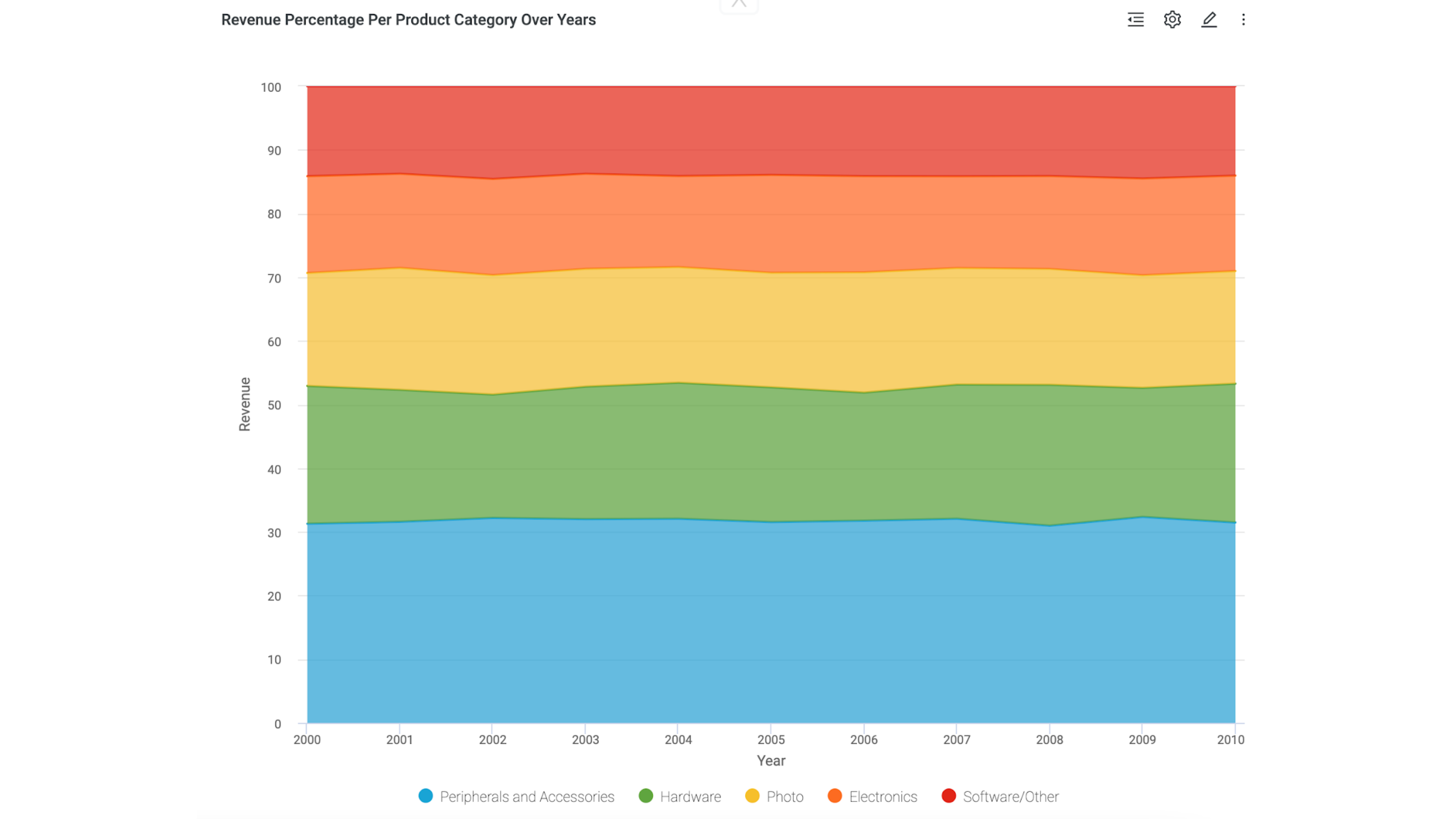
In this example, you will create a percent area insight that shows revenue per product category over years. The example uses the SALES schema that comes with the Sample Data.
In the Cluster Management Console (CMC), you can create a tenant that includes Sample Data. The Sample Data includes the SALES schema.
Add an insight
- In the Action bar, select +.
- In the Data panel, select Manage Dataset.
- In the Manage Data Sets panel, in Tables, select the SALES schema.
- Close the Manage Data Sets panel.
- In the Insight panel, under Charts, select Percent Area.
- From the Data panel, drag and drop the following columns to the respective tray:
- From the Sales table, drag and drop Year to the Grouping Dimension tray.
- From the Products table, drag and drop Category to the Coloring Dimension tray.
- From the Sales table, drag and drop Revenue to the Measure tray.
- Select the arrow to the right of Category to open the Properties panel, and then drag and drop Revenue to Sort By.
- Select the arrow to the right of Revenue to open the Properties panel, and then for Format, select Dollar.
- Name the insight Revenue Percentage Per Product Category Over Years.
- Select Save.